Briefing End Project
New design and technology solutions are found in nature. The research and development of this particular part of the professional field is called ‘Biomimicry’. You will research this subject and going to look how to translate this to a new home goods brand or a magazine. Both choices don’t have restrictions but do have mandatory parts. The name (for the brand or magazine) and creative direction still has to be chosen, and that is where you as designer comes in.
 |  |  |  |
|---|
So the coming eight weeks you will work on this project, starting doing research and ending finally with a three dimensional presentation. This project will be the last project in this form so let it represent your strengths and also make choices based on that.
You will weekly report you progress based on the competence points to the tutors. You'll keep track of it in a process document that will be handed in together with the technical packages on an Disk or USB. Besides technical files there also need to be made (an) end product(s) which you can hand in together with the USB and the process documentation, and also present in the presentation.
Stylebook
Save Our Souls
"We have to save ourself now. We must become aware of what nature is giving us and what we take from it. We must take more solutions and less of our materials out of the nature, because else we will destroy her. And we can't do that, nature is in our soul..."
Those were the ending words of Janine Benyus, a Biomimicry Scientist, during a presentation I watched while doing research. The idea of not only taking from nature but also respect and protect it is the inspiring factor to me.
The urgency call this scientist does formed the base of the brand Save Our Souls. A brand that is inspired, made out of and protects nature by helping it to scale down the amount of waste by recycling the material nature gave us.
The front of the stylebook made for the Save Our Souls brand represents the biggest filter of nature and where the SOS-sentence is used most: In, on and around 'the Ocean'. The content of the book deepens out the target group and are the steps and choices that are made for the creative direction of the brand.
 The front of the book represents the waves of the ocean, which filters out waste and throws it on the beach. |  For the rings of the booklet cotton cord is used. The ends are holded together by copper tube which was founded on the beach. |  On the front it is visible that it is about Save Our Souls but for whoever who missed it. The 'Stylebook'-font is a alteration based on a original Jellyka font. |
|---|---|---|
 Overview of the pages and some of the inspiration used for the project. |  The target group is a imagination of a male and female person who loves each other but also love (living around) the ocean. By combining their values and taste a new style in which they feel comfortable will be created. |  |
 Instead of making a digital moodboard the decision came on collecting products that translates and represents the inspiration and values. |  On the left side the more masculine fonts to represent the male, and on the right side the more flowing lettertype which represent the women in this collection |  Harder and softer pastel colors are combined to represent both genders in this collection. The colors are inspired by the lifestyle of living around the ocean. |
 A few printing techniques which represent craft and the use of natural elements to develop the prints. |  Materials found around the ocean form the details of the collection, because the most of the time they do not provide enough material to make products of. So some natural fabric and material is added. |  To give more depth on the material and product to distinguish the brand, a few possible edits on the material are presented. |
Photoshoot / Brochure
A mandatory part in the project is the need of a medium with only self created images. So whether it will be a website, brochure or magazine with drawings, photo's, collages or a combination of it depends on the designer, medium and products.
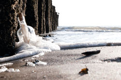
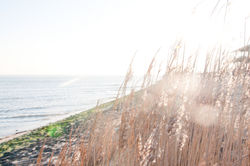
The life at and in the ocean is the visual inspiration of this project. So there is chosen for a photoshoot at the beach for a first collection, which feels the most natural. To get the right vibe two sessions were needed. For the first one styling-items are taken to Katwijk.
Because it didn't result in all the needed images, the second trip lead me to Vlissingen. A three hour long trip by train so didn't took to many stuff. But the small amount of people and improvisation with the wreck-stuff over there gave the right vibe and resulted in some valuable pictures.
As designer in fashion it is important to beside communicating visually you'll need to about the tactility you communicate. So a brochure was chosen to communicate the message of Save Our Souls on. Because of this the decision came on printing with inkjet on aquarel paper of 300g, which is made out of recycled paper. It gives a matte outlook which is sustainable without losing the feeling of quality due to the heaviness of the paper.
 |  |  |
|---|---|---|
 |  |  |
 |  |  |
 |  |  |
 |
 |  |  |
|---|---|---|
 |  |  |
 |  |  |
Product Realization
After the concept is created and taking stock of materials is done, the real designing and realization part is starting. It is the phase that the project is coming alive and gives the most satisfaction for me as designer.
The choices that had to be made are made and give the backbone of creating new unique products that are an added value to a society that is overtaken by a lavishness of goods.
Below the realization of other products can be found. And you'll see that to stand out in the crowd even the hangtags in this project are treated if they are small artworks.
When not forgotten photo's were made if the making process, because most of the times designers are so focussed to finish we just forget to document our progress. In the description there is also some info added.
 First ideas, solutions and calculations just sketched on a sheet of paper, because it's the fastest translation from my brain to reality. |  After producing a quantity of sketches the few to proceed with are taken into a dummy. They are combined or finalized. So a print which began as an idea for a bag can end up at a hangtag. |  First tryouts for a thinner transferred branding label |
|---|---|---|
 A Lumidye print on a bag made out of undyed bio cotton. |  On the other side a small Lino print. Also a closer look to the handle of the bag, which is made out of a piece of a branch found on the beach while doing the photoshoot |  Different try-outs on materials are done before going to the end-result. First on the left is salt water sprayed on a piece of fabric. It almost isn't visible so added some color pigment to it and made the middle one. On the right you'll see different type of paper glued together and polished and sanded after. |
 After printing the hangtags were polished and sanded till the end result in the eye of the beholder was reached |  End result of the hangtags. The green one with the cut out logo contains spare buttons. It's sprayed with salt water which crystallizes when water is vaporizing. |
End Presentation
To end the project a 3D presentation of the products is needed to be exposed in a area of 1.25m wide and a maximum of 0.75m to the front. A white wall piece of 1.25m x 2m is provided. The use of glue, screws, pins or nails are not allowed on this piece.
To expose such products on a blanco wall-piece was even not an option, for this reason a leftover of wallpaper is strapped over and taped on the backside. By adding some small extra style items on the wall the project became more visual. And when products are connecting they start to creating the atmosphere which first was only an idea on paper.
 |  |  |
|---|
